My experience thus far as a participant in Barnard’s A Virtual Enlightenment seminar has been nothing but extraordinary. All of my preceding expectations have been blown away and I feel as though I am on a rising exponential learning curve. As the image of such curve exists in my head, I see it twofold; firstly as a educational journey that is fast-paced and challenging on new and unexpected levels and secondly as an eye-opening journey that is yielding gained intelligence and out-of-the-box thinking I could have never imagined being capable of. Later in this post I will touch on specific challenges I have encountered thus far with our digital assignments and with wrapping my head around the seemingly infinite possibilities of our projects. In regards to this seminar’s ability to teach me and push me beyond previously reached academic boundaries I have little evidence to prove such personal internal transformations beyond anecdotal examples; most prominently I have a re-occuring tendency to speak at great lengths about my readings and digital assignments with my family and friends. Sociologically, if I were to take a survey of how often I talk about this course and my excitement surrounding it, the data would yield nothing less than once per day. I am constantly thinking about the stories of the intricate 18th Century French interiors and their ability to inanimately expose characteristics of their masters that our readings have covered so far. For instance I feel I reminisce on the idea of how different modern life would be if every desk had secret compartments and locks recalling Alice and Wonderland fantasy like 18th C French furniture did.
Perhaps the most rewarding component of this class so far has been the digital lab and assignments my peers and I are charged with on a weekly basis. To articulate my passion for this course, is in a nut shell, the juxtaposition and intertwining of digital ideologies and techniques with decorative arts and furniture of 18th C France. The subject matter alone of this seminar (furniture and decorative arts) is incredibly specialized and endlessly interesting to me. However, I would have categorized myself as technologically illiterate at the beginning of this course and the natural progression of my understanding and grasp of digital literacy is beyond empowering. The thought that I will be able to pair digital ideals with academic scholarship on 18th C decorative arts is incredible. My love of such relationship though, has been tested by the inevitable frustrations that come with “enlightening” myself on HTML code and CSS code. Our first assignment in the digital lab was to code a personal website for ourselves that incorporated color, differing fonts, an image, and a short bio. Our second assignment was to incorporate a three-part or four-part layout to our website, structure it with mindfulness of design, and make it more complicated; all with the caveat that in class we had to explain exactly why we chose the color, layout, font type, positioning of elements etc. to our digital professor, Professor Alex Gil. Below are screenshots of my week 1 product and week 2 product:
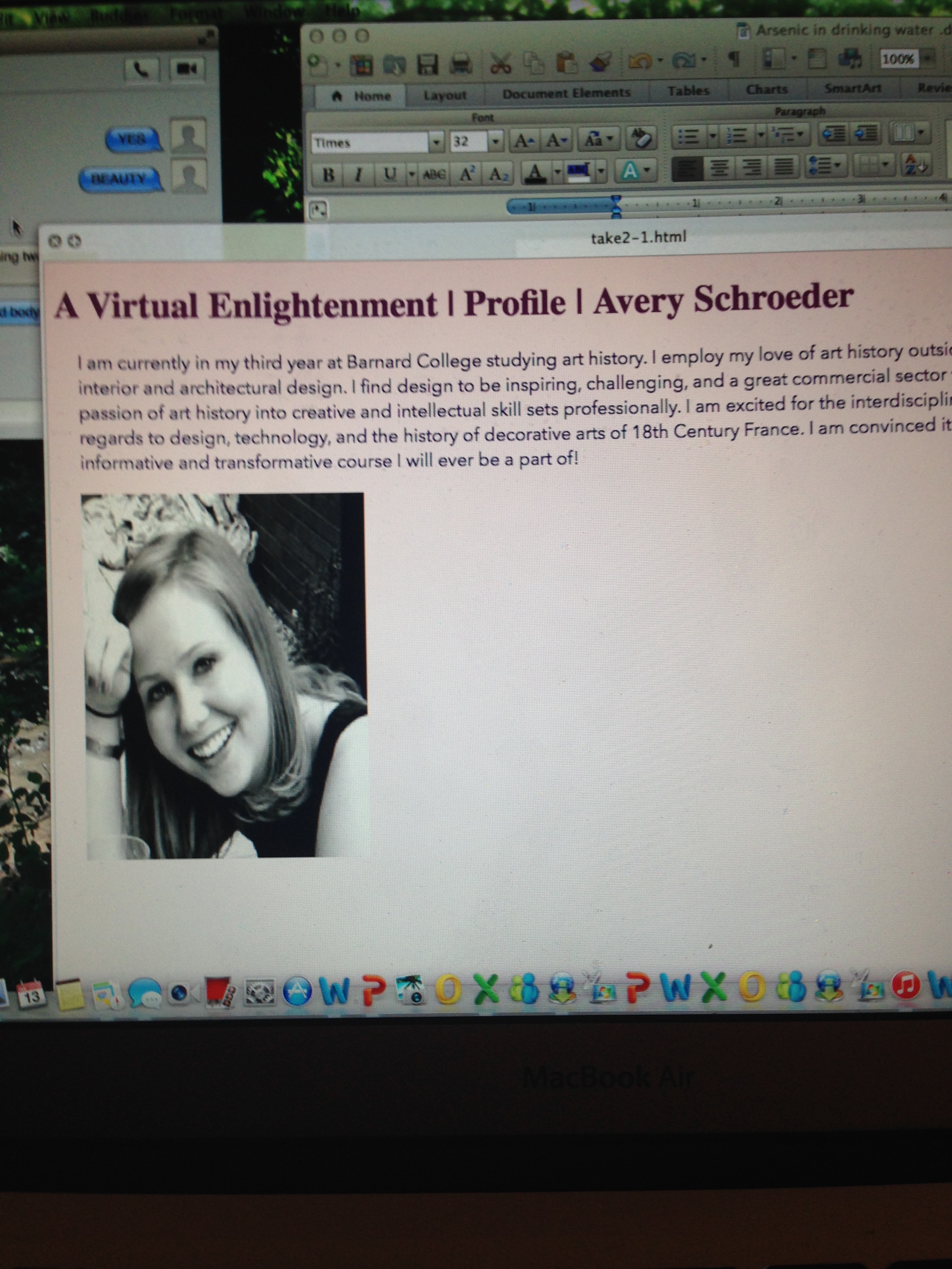
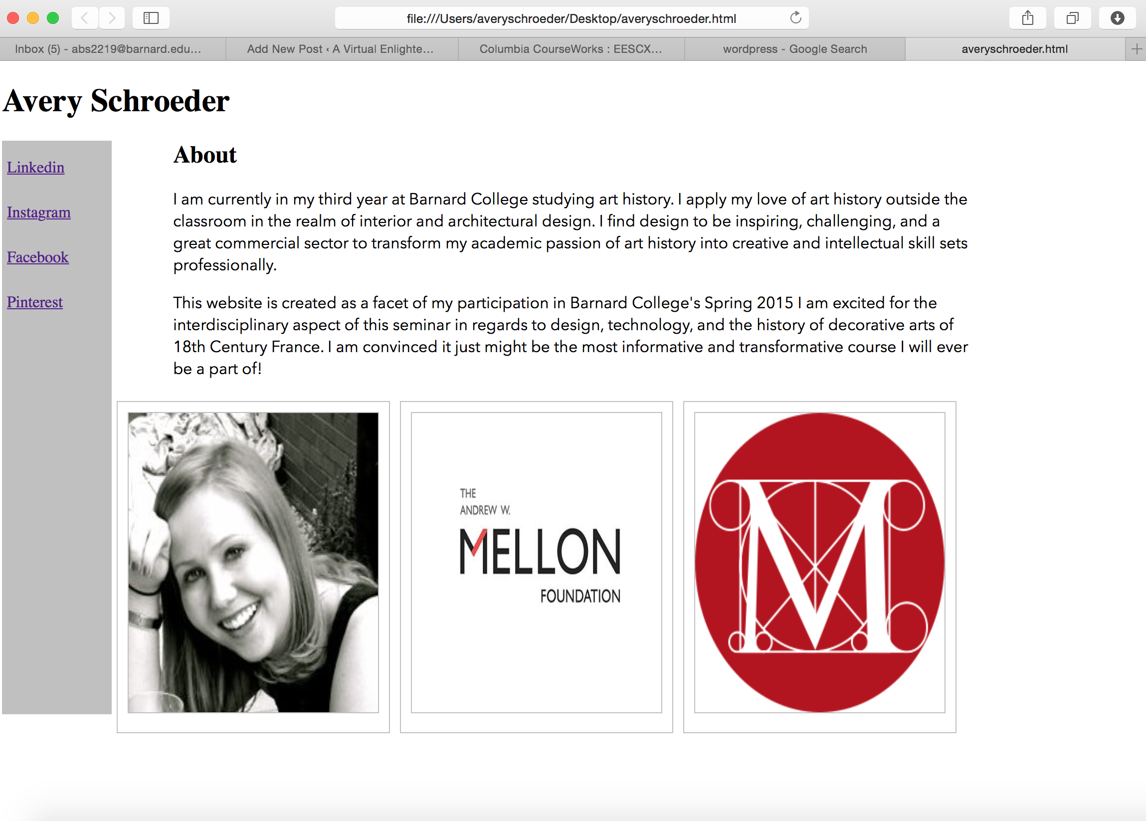
As I mentioned above, previous to this class I would have characterized myself as rather technologically illiterate, therefore it should be no surprise that I have hit a handful of glitches and residual frustration at my computer in my efforts to complete these two assignments. In the first week, I began my digital enlightenment journey by spending hours in Butler Library taking notes on “w3schools.com” chapters on various HTML and CSS properties, tags, etc. After I felt like I had a basic understanding of how HTML code functioned and how CSS code could be called upon and utilized, I set out to build my website on TextWrangler (a text editor application which I downloaded onto my Mac). I hit my first major roadblock when I tried to code inserting an image…my first couple of tries failed miserably as they yielded nothing in the website domain other than the line of code. In other words, where my line of code in TextWrangler (i.e.<p><img src=”http://bit.ly/1zde4VS” width=”250″ height=”300″></p>) should have been read by the computer as code to produce an image…it showed up on the screen (on my website) in the place where I desired the image to appear as itself- the line of code. This was the most memorable issue I had throughout the first week with my website. Now the second week was a totally different story…that’s when things started getting progressively more difficult and altogether confusing. Initially I had a hard time understanding how to construct a three-part layout in my HTML document that was ruled by CSS in my external StyleSheet. I watched repeated tutorials on Lynda and read chapters on w3schools.com about constructing layout-esqe templates though I never found a straight forward explanation or example of coding layouts; maybe such things eluded me in my research or maybe because every website is structured in a three-part or four-part layout and they are all so different, there isn’t a universal simple example. Regardless, I eventually figured it out through trial and error. I also had difficulties with the left navigation bar in all sense of its construction. Articulating its height and width was both a logistical and aesthetic issue for me. In terms of aesthetics and functionality, I tried multiple options as to what would ‘live’ in the navigation section of my website; did I want a description of the course linked, a link to the Met website or did I want it to focus more on myself as a student and young adult. In the end I decided to link all of my social media platforms to the navigation bar. I did this because I felt each of my social media platforms (LinkedIn, Instagram, Facebook, and Pinterest) yield different facets of me to a viewer. I chose a light grey to be the background because I felt it worked well with my simple color scheme of white, black, and red. Initially, as you can see in my two screenshots, I was going for a more colorful webpage because I find color to be a very important detail to life. I opted for a white background with white text on my ‘version 2.0’ because I was looking to construct a clean, simple, and sophisticated webpage. The red came into my website when I thought to include the Metropolitan Museum “M” logo and the Melon Foundation logo in addition to my personal photo. Coincidentally, both logos had red in them and I liked the aesthetic of the ‘pop’ of color. As for this upcoming week, we are charged with adding elements of JavaScript to our websites. Stay tuned!